


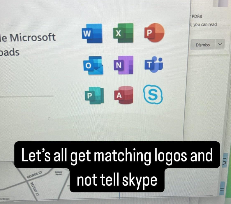
Graphic design is my passion
Thanks, I hate it.
This is probably better and clearer than whatever they might do lol
the other ‘p’ is publisher? they’ve pulled the plug on that one too. will literally get yanked from 365 subscribers in october 2026.
if you want to ensure you have this application (i have a number of clients that rely on it) long-term, you need to buy a perpetual license for an office edition that includes it.
I was trying to get to my SharePoint but it wanted me to chat. I don’t want to talk to anyone, I want my files!!!
I think that matching logos with some kind of rainbow puke that’s means nothing is one of the biggest sins of modern designers.
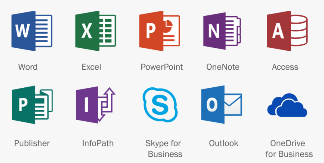
Not exactly nothing, all the Office icons are visual representations of the main thing you can do with the app. A sheet with lines on it for Word, a sheet of cells for Excel, a very impressive diagram for Powerpoint …
Access is admittedly bit unclear but somehow people have always visualized databanks as cylindrical silos. Because databanks’re used to ferment the data before being fed to the C suite (C is for cattle).
The older icons were more obvious though.
For example 2016 version.
Looks like OneDrive is next.
We can only hope
Hey now, I’m lazy and don’t want to setup a SharePoint server just to sync my OneNote notebooks to mobile. It’s the one thing I use OneDrive for.
I’m sorry I can’t hear you through those nonsense words like “SharePoint”, and “OneNote”. I have the Microsoft ShareVault HyperSync on my WaffleGrid 360 Cloud Turbo, can you ping me there
Hahahahahaha, take the upvote for making me chuckle.
The stupid names devs give to software.
especially the macos version of those icons! the new icons are such a downgrade imo

Each version of office is a downgrade.
Change the X in the Excel icon to E and you can spell out “PENIS” in your taskbar :)
I guess we agree then.^^ You saying “the old icons were clearer” is essentially goalpost-moving over thread op saying “the new icon mean nothing”.
I am not goalpost moving. Just pointing out that your argument of the icons being clear is valid for the older icons. The new ones are just coloured blobs.
I actually didn’t realize until y’all’s thread here that the new icons actually do contain a stripped down version of those older, clearer indications. I’ve looked at them many, many times and just saw meaningless vague color gradients.
They are bad 🤷♂️
I said “visual representations of”. I never used the word “clear” (I did in my second comment, but only to paraphrase that you said “obvious”). And no, they’re not “blobs” (i.e. amorphous spherical things), they are primary shapes. Those shapes do represent the primary function/interface of each app in some way.
I call them blobs mainly because they are not distinct enough.
Alright, how do you differentiate between W X P N and another P? They look exactly the same and you need look very carefully to understand that blue rectangle is sheet with lines on it and green rectangle is sheet with cells. That’s exactly what I was writing about in previous message.
I am not going to argue these are the pinnacle of design. (I do happen to like the idea of shaded segments though, but that’s just opinion.)
But they’re much better than whatever Adobe came up with. Xdddd

Two things can be bad at once. 🙃
Sure. But I’d say there’s “truly bad” and “acceptable” here. :)
The part that kills me is that a lot of these apps are for graphics and graphic design of one flavor or another. But it’s like they did anything but hire someone to use their tools to fullest on this. Its mind-boggling.
I think a hallmark of bad logo design is needing to put the first letter of the thing on your logo because the logo itself is so unrecognizable that a user has no chance of figuring out what it is without the letter
It’s obvious on my phone. It must be significantly more obvious on an actual computer screen.
AWS does this and it’s so ugly. Does seem like they at least use the colors to group services conceptually, but still. Not like that jumps out at you, I had to go check one day.
Just these bright, garish icons that are unnecessarily loud, but without saying much, jacking up any presentation or diagram they’re used in. I think they offer a couple simpler variants maybe, but woof.
You can rearrange the letters to spell “AX PP NOW”
Is Microsoft pushing the woke agenda??? I’m making posters for the homeschooling convention
As a pp haver, I am concerned. Pray tell, is there more information about this secret woke agender?
Bonnjour. We are the woke agenders. Lower your pants and surrender your pp. We will add your biological and technological (smartphone) distinctiveness to our own. Your gender will adapt to service us. Resistance is futile.
It’s worse than I thought. :/
We even have spelling mistakes! Naughty us…
Wrong PP, they meant the Canadian conservative leader, who got voted out of his own riding so kicked a dude out of of their Albertan seat so he could stay in power (the guy he booted had 84% of the local votes, literally the safest conservative seat in the country).
You left out [S]kype and [T]eams. That doesn’t count!
TAX PP SNOW
For good reason.
AX PP NOW, Taylor Swift!
Tax PPs now??!?
Oh that’s perfect IMO! :)
Skype doesn’t count.
At least we still have Skype (new), Skype for Enterprise, and Windows Skype
Don’t forget OneNote and Windows OneNote
That feeling you get when the locks are changed.
WOPXNAPTS
I haven’t used Windows nor Office for so long I have no idea what half of those icons are for. Word stopped being great around 2007 when the ribbon was introduced. Before then, it had an amazing UI, the right amount of features and allowed you to do your work. N? T? Turquoise P?
Now, wow. It blows my mind people put up with all that.
Lucky you, you don’t have to deal with the fucking T.
said the balding 25-year old guy to his sister who just started taking estrogen
The web version is unbelievably shit.
I’ve watched a millennial uni student dick about with his laptop trying to find where tf his files are, not knowing the difference between the cloud and his local computer. University level.
I think all web software is unbelievably shit. The web is for porn, not software.
preach
A fellow fan of office 2003! The ribbon was a terrible change and it has only gone downhill from there.
MS used to be at the forefront of UI, but now? You may be interested in: https://github.com/pi0/clippyjs
Oh man, that really brings back some memories.
Publisher is on the chopping block too.
These icons are all changing a little anyway.
how lovely. i’ve always hated corners
Huh. I used publisher to make shitty websites on windows xp.
I blame people for publisher failing though. People complain left and right that images and different fonts don’t work in word … when literally it wasn’t built for that. Publisher is where people should go for flyers, booklets, etc. but people are stupid with computers and would rather hammer in a screw with intense force than take the screwdriver that is sitting right there.
Now we have an incredibly bloated word that tries to do all of that, while publisher is being killed off
Its gone and I never once used it.
Too soon


