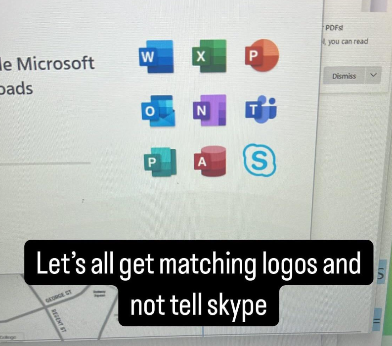
Alright, how do you differentiate between W X P N and another P? They look exactly the same and you need look very carefully to understand that blue rectangle is sheet with lines on it and green rectangle is sheet with cells. That’s exactly what I was writing about in previous message.
The part that kills me is that a lot of these apps are for graphics and graphic design of one flavor or another. But it’s like they did anything but hire someone to use their tools to fullest on this. Its mind-boggling.
I think a hallmark of bad logo design is needing to put the first letter of the thing on your logo because the logo itself is so unrecognizable that a user has no chance of figuring out what it is without the letter


Alright, how do you differentiate between W X P N and another P? They look exactly the same and you need look very carefully to understand that blue rectangle is sheet with lines on it and green rectangle is sheet with cells. That’s exactly what I was writing about in previous message.
I am not going to argue these are the pinnacle of design. (I do happen to like the idea of shaded segments though, but that’s just opinion.)
But they’re much better than whatever Adobe came up with. Xdddd
Two things can be bad at once. 🙃
Sure. But I’d say there’s “truly bad” and “acceptable” here. :)
The part that kills me is that a lot of these apps are for graphics and graphic design of one flavor or another. But it’s like they did anything but hire someone to use their tools to fullest on this. Its mind-boggling.
I think a hallmark of bad logo design is needing to put the first letter of the thing on your logo because the logo itself is so unrecognizable that a user has no chance of figuring out what it is without the letter
It’s obvious on my phone. It must be significantly more obvious on an actual computer screen.