

This layout makes sense if you have used an old school mp3 player or similar.
Volume is left and right because it’s an analog of the volume bar on the screen.
Up and down is previous and next because play was controlled by a list UI so you were moving a cursor up and down between songs.
It’s not how I personally would prefer it, but it’s not as outlandish as it seems.
Thank you for making this make more sense.
That makes a lot of sense. I still hate it, but i understand the justification for it now.
I still feel like this is sillt… I’ve owned a lot of mp3 players and none of them worked this way. Was this a zune thing or something?
Every mp3 player I owned in the 2000’s worked this way. Screen above, controls below, list UI for tracks, usually volume rocker or dial on top.
Sometimes the UI would be more complicated and would include a left/right button for navigating horizontal menus (like my all time favorite Zen Vision:M) but the basic playlist was still a vertical scrolling list UI.
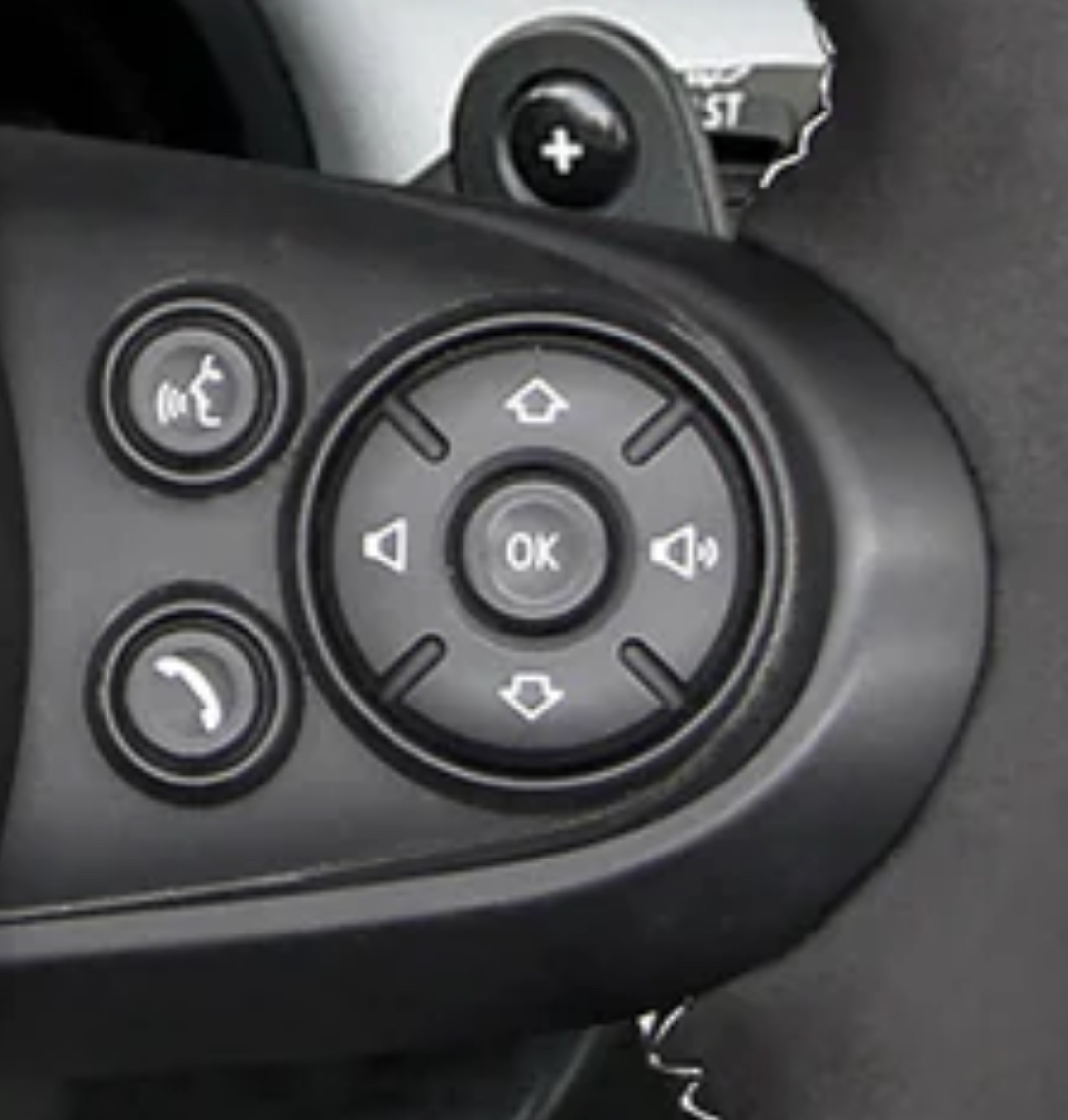
I want to know why do many cars don’t have a play/pause button on the wheel, but do have a source button.
I change my source from my phone exactly never. I want to pause the audio all the time.
bro I swear whoever designs the interfaces in cars must be the CEO’s nephew
My Hundyai has a programmable star button on the steering wheel that can be tied to media on/off.
Kia also.
Fully remappable steering wheel buttons is a great idea.
My Tesla has one, but I haven’t yet figured out what best to do with it. The current leading contender is wipers - auto wipers are not sufficient. Also I hesitate to rely on and get used to primary co trol in custom places
I’ve been wishing for play pause since audio books and podcasts came into the world. It’s ridiculous that nobody has this button in 2024
My Jeep has it and it’s from 2018.
deleted by creator
I change the source regularly between my phone and the radio, but I don’t use any of the wheel buttons, so I’m not even sure if my car has a source button on it.
Hey, at least it’s not a touch screen :)
Nailed it. Even the worst interface with buttons is miles away from the best touchscreen interface. You are like driving, you aren’t supposed to look at the screen and tap things on it to switch a song or whatever. You navigate a missile that weights at least two tones and can undo a crowd of pedestrians or break a wall in a building. You are in no position to focus on this tiny LED that some insane idiot mounted there. Yet, it’s there.
Made by people that use a volume slider and swipe for next… Such a horrible design in cars.
Return the car, it’s obviously built by morons.
At least you have those ridges dividing the directions. My car has similar but oriented correctly and no ridges. All too often I skip to next when trying to increase volume. It’s really annoying
Rotate the
controlsthe whole car 90 degrees CCW.It’s on the steering wheel. He can just steer and that solves the problem.
Yep, steer perpetually to the left. Maybe play Beyonce in the background.
Same as my Toyota. It’s a crazy indicator of how we expect things to be, but it’s absolutely not a deal breaker.
My Tacoma, as well. Recently, I modded that to function correctly (up/down vol, R/L track). Easily the best $50 I’ve spent on the vehicle.
Does that screw up the controls for navigating the dashboard menu?
No, those controls are separate on the opposite side of the steering wheel
I drove this make of car for a while; there’s an optional head up display where the up and down buttons here let you cycle through contacts/the song queue/radio stations. I’d imagine it’s the same interface without it, just displayed somewhere in the car where you’re not looking while driving.
Having it so that up/down moves you up/down through the list when there’s a visual display is way more intuitive than up/down being volume - frankly the volume bar on Windows, Mac, many TVs etc. goes from left (quiet) to right (loud) anyway
The speak-button looks like a farting stick-figure.
This is a Mini Cooper steering wheel.
My VW is like this as well. I don’t like it either.
Yet one more item in an endless exhibit of how mankind is unable to standardize anything at all. Get TWO engineers together to agree on ONE standard plug and the assholes will come out with THREE separate plugs, completely non-compatible with each other, of course.
It’s almost like a miracle that we got the world to agree on certain things like time and timezones, a system of coordinates, the metric system.
All of them received initial pushback, and some to this day. Noisy, noisy fucking humans.Did you know that for a few decades, every town in the UK kept two different times on adjacent clocks? Back when their railway grid was expanding everywhere. Local time and London time.
Funny enough, it’s not the engineers that are doing it. Left to their own devices without ridiculous constraints like “someone else is doing it this way so we need you to do something that sets us apart” or “you can’t look at what everyone else is doing”, engineers will do it the laziest way they can… By copying what others are doing and essentially making it standard.
Yeah usually when engineers take extra effort to do something non-standard, it’s at a specific request from a client or management
Cars should come with ✖️⭕🟪🔺
Drove a Kia once and it was the same. Up went back a track, down went forwards. Opposite of my intuition.


