Every mp3 player I owned in the 2000’s worked this way. Screen above, controls below, list UI for tracks, usually volume rocker or dial on top.
Sometimes the UI would be more complicated and would include a left/right button for navigating horizontal menus (like my all time favorite Zen Vision:M) but the basic playlist was still a vertical scrolling list UI.


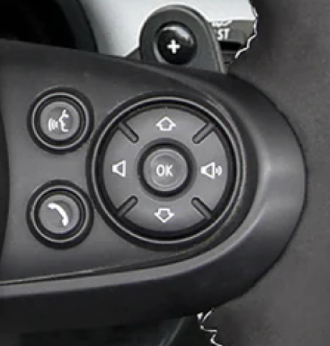
This layout makes sense if you have used an old school mp3 player or similar.
Volume is left and right because it’s an analog of the volume bar on the screen.
Up and down is previous and next because play was controlled by a list UI so you were moving a cursor up and down between songs.
It’s not how I personally would prefer it, but it’s not as outlandish as it seems.
Thank you for making this make more sense.
I still feel like this is sillt… I’ve owned a lot of mp3 players and none of them worked this way. Was this a zune thing or something?
Every mp3 player I owned in the 2000’s worked this way. Screen above, controls below, list UI for tracks, usually volume rocker or dial on top.
Sometimes the UI would be more complicated and would include a left/right button for navigating horizontal menus (like my all time favorite Zen Vision:M) but the basic playlist was still a vertical scrolling list UI.
That makes a lot of sense. I still hate it, but i understand the justification for it now.