- cross-posted to:
- [email protected]
- [email protected]
- [email protected]
- cross-posted to:
- [email protected]
- [email protected]
- [email protected]
cross-posted from: https://toast.ooo/post/8396304
OK WE’RE ACTUALLY LIVE NOW
a little hiccup at the start but we’re here
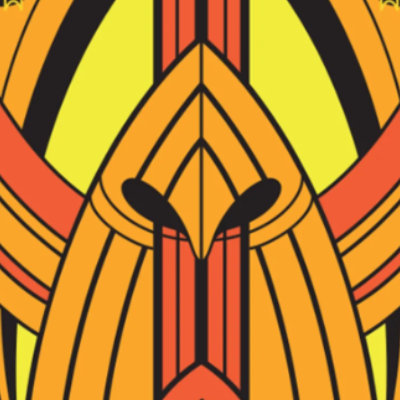
The Enterprise-D is all set up in the top right corner of the canvas.
Obviously, the ship is the highlight, here - I’m thinking we should probably outline it in black, and then fill it in (ideally with better colours than the ones in the template - I just used those for shading).
The starfield is less important, and should provide a nice space for people to blend our template with the others.
Have fun!
I think it looks great!
I’m no longer available today, but I was working on replacing the light blue pixels with light grey - it just seems to look better.
If anyone is able to finish that, awesome. If not…still awesome!
I think a lesson learned for future years is that we can’t have any significant sections white pixels.
White areas are just an invitation to populate with other things.
I’m wondering if @ValueSutracted or @Corgana could save a screenshot of the Canvas pixel colour set. That way, next time a template is designed, it could have more of a one-to-one correspondence with the options in Canvas.
Other lesson (although it wasn’t a problem in previous years) is that if we want the website banner, we may need to get that sketched out very early.
For future reference:
Fantastic!
And it looks like we need to hold the line again.
Someone seems to think the plain grey area on the left hand side of the saucer needs another decal.