Hey everyone.]
So update 98/99 has gone live which fixes the crashes (thanks for the reports).
I’m gearing up for a pretty sizable release but just wanted to check in and ask if there was any issues you’re having that I should know about or any new feature requests.
Sorry for the bad comms but I’m making my way through lots of messages and posts on here. Thanks for the patience as I get through these all.
Cheers, Lj
Umm… Redgifs stopped working
Dad please turn the porn back on
Removed by mod
Fix is going live. I completely rewrote this part and should be able to fix it remotely in future without deploying a new apk.
I’m partly colorblind and it’s super hard for me to see when I upvoted or downvoted a post. Just making the up or down arrow bolder (or circled) once it’s been clicked would fix the issue completely for me and all types of colorblind people.
Thank you for the great work 💛
Added support for the next release to change the colors.
Doesn’t really help when in grayscale mode on Android.
Which view type are you using?
Changing default sort to hot does not stick for me.
Redgifs is broken (as is tradition) ¯\_(ツ)_/¯
Device information
Sync version: v23.11.29-22:27 Sync flavor: googlePlay Ultra user: false View type: Slides Push enabled: false Device: bluejay Model: Google Pixel 6a Android: 14Settings > Account settings > post sort?
You’re not gonna believe this man, but you can actually directly link to the setting ;)
deleted by creator
I can set it there but visiting my instance or my subscribed it still always sort by active instead of what I have set
Edit: I just notice that there is a save button . It works, when I save 😉
Fix for redgifs is going live now.
Did you change it here?
Settings > Account settings
Yeah, my problem was in just overlooking the save button at the top right of that page. Maybe a reminder if you leave without saving would help or make it autosave when a setting is changed.
He lives!
I thought I made a post, but it didnt get any replies and doesnt show up on the community posts for me.
But I was running into some posts where the image fails to load, like this one
https://lemmy.world/post/12685097
While the thumbnail sometimes loads, the image gives me that error.
Also been running into a lot of images that say “image was actually a webpage” or something along those lines.
Thanks!
That loads for me with no issue.
checking back on it now, it seems to be working again. Weird!
I’d love it if clicking on the thumbnail of an image opened the raw image, instead of the compressed view, so instead I have to go into the post and click the image there for full resolution. It’s especially noticeable for larger images with small text.
I’m eagerly waiting for separate upvote and downvote counters 😼 but let me know if you were only asking for features not discussed previously to shut up next time
Just wanted to say thanks for the post, even if it was a quick one to say releases are coming. I had been considering signing up for your paid version but was hesitant to pull the trigger because I feared the project had been abandoned. Since it’s not, I’m signing up now. Appreciate all the work you put into the app!
The only bug I’m having with Sync for Lemmy is that it does lots of wakelocks in the background, I had to set the app to restricted mode in the battery settings as a workaround.
I don’t know if this is because it tries to fetch notifications (a feature not available yet) or IDK.
Setting it up to “restricted” instead of “optimized” basically fixes idle issues, although I can see the app refresh a lot more than when it is optimized…
Sync for Reddit never had this issue, I always had it in optimized mode and it barely was active in the background.
Pictures for reference:


EDIT: I am experiencing this issue with AOSP, with MIUI I did not, but I’m guessing it is only because MIUI is more aggressive with apps in the background.
EDIT 2: Also I’m seeing a new gap just below the main post in the newest version 😅
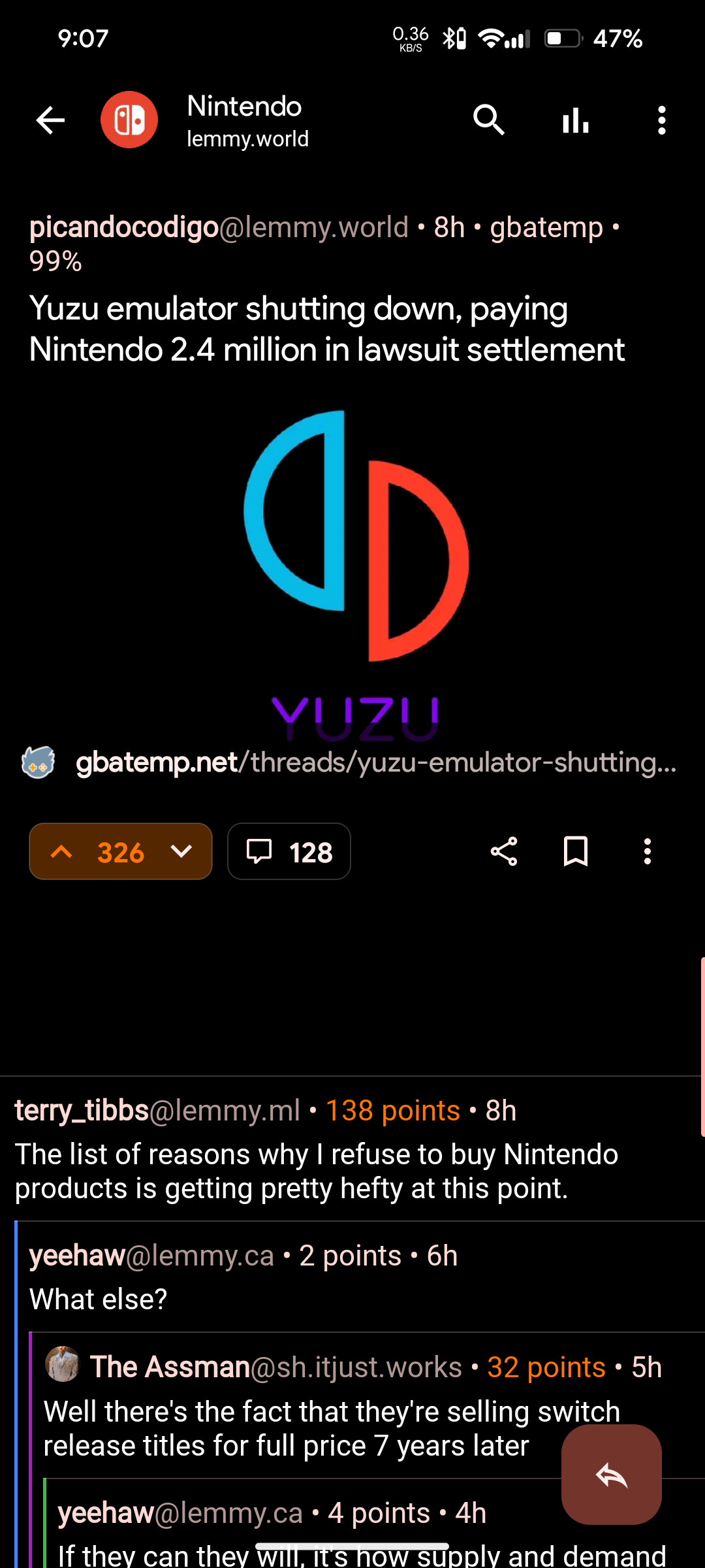
I also noticed a gap, and I’m wondering if it’s where the ad banner is now. I really hope not and that this is just a visual bug, because it’s pretty glaring and distracting.
Sadly I just corroborated it, and yeah, it is an ad :/
Hopefully dev will get rid of it, I think it was enough with the ads in the main feed.
Even Boost ads are not that distracting.
What app did you use to detech wakelocks? The battery monitor tech in RealmeUI also complains when sync uses excessive battery in the background.
Images like the one in this post don’t automatically open at full resolution. There’s a discussion in the comments about the steps to get it to open at full resolution.
Seems to work for me. Seems to display the higher resolution in a mosaic. As I zoom I can see the text sharpen.
I get a really low resolution version unless I follow that work around that someone suggested on the thread.
Clicking on the image and zooming in works no?
Well this is weird. When I’ve gone on it again it loads at full resolution and I can zoom in fine. When I was opening it yesterday it seemed like it was just opening the thumbnail.
Works for me
Can we have the swipe mode for pictures that we used to have in Sync for Reddit?
I second this. It is the option in the three dots when viewing a stream of posts, right? I recall it had the icon of a finger and and arrow and was called “Swipe mode”.
Features wise, full mod tools would be awesome, but I figure you’ve got that on the list already. Same with the latest lemmy stuff like instance blocking at the account level.
Beyond that, the only thing I can think of is more granular control over theming. I finally found a set-up that’s working for me, but I know it took some fiddling that could have taken less time if I had been able to tweak background colors, or whatever. I’ve seen other people talk about that for sync, as well as other apps that a don’t even have the options sync does. From a usability perspective, contrast between sections of the ui can be the difference between literal headaches and a relaxing scroll.
But, again, that’s pretty low priority imo.
Good to see you’re still alive! Looking forward to future updates and improvements.
I have a feature request. Harmonic for hackernews has the option to open a url directly on archive.org, which I think is a pretty neat feature. Would it be possible to add this?
How would that work exactly?
Like this link https://google.com would open https://archive.org/details/google.com ?
You can use the wayback machine api to retrieve the latest snapshot of a particular url, which is useful to evade paywalls.
I just tested with a random link and it’s exactly that.
In Sync for Reddit we had the ability to view previously upvoted posts. I don’t know if Lemmy supports that, but that was a feature I used often to go back to something. Thanks
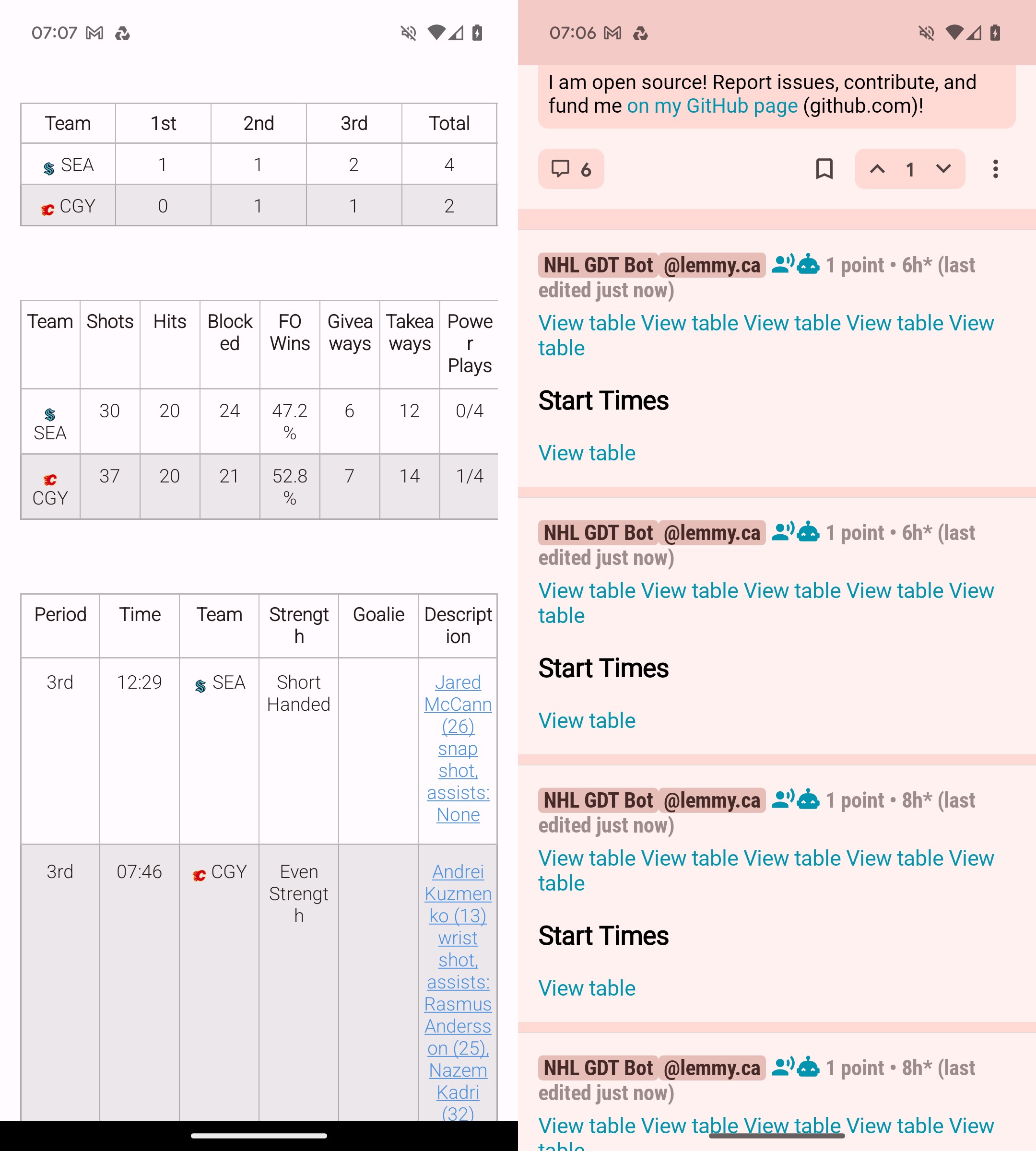
Using Boost for Lemmy as the example here.
Since release Sync just hasn’t been able to handle tables. Every other app I use does it no problem, but sync really struggles with it.

Another example, although less painful for the eyes.
Can you link the post? What to see to see how it works on my other lemmy apps.
https://lemmy.ca/post/16714260
I think that’ll work. Still not entirely sure on how Lemmy handles links.
Well in this example, I’d say it’s just differently formatted. The borders are not visible and Text isn’t centered.
In the example before, I feel like it is that Sync hides the table when it is too wide/or the multiple tables are tried to be placed side by side instead of below each other? I’d also prefer the left side, probably 👍 But tables are a nightmare these days with dynamic layouts.


