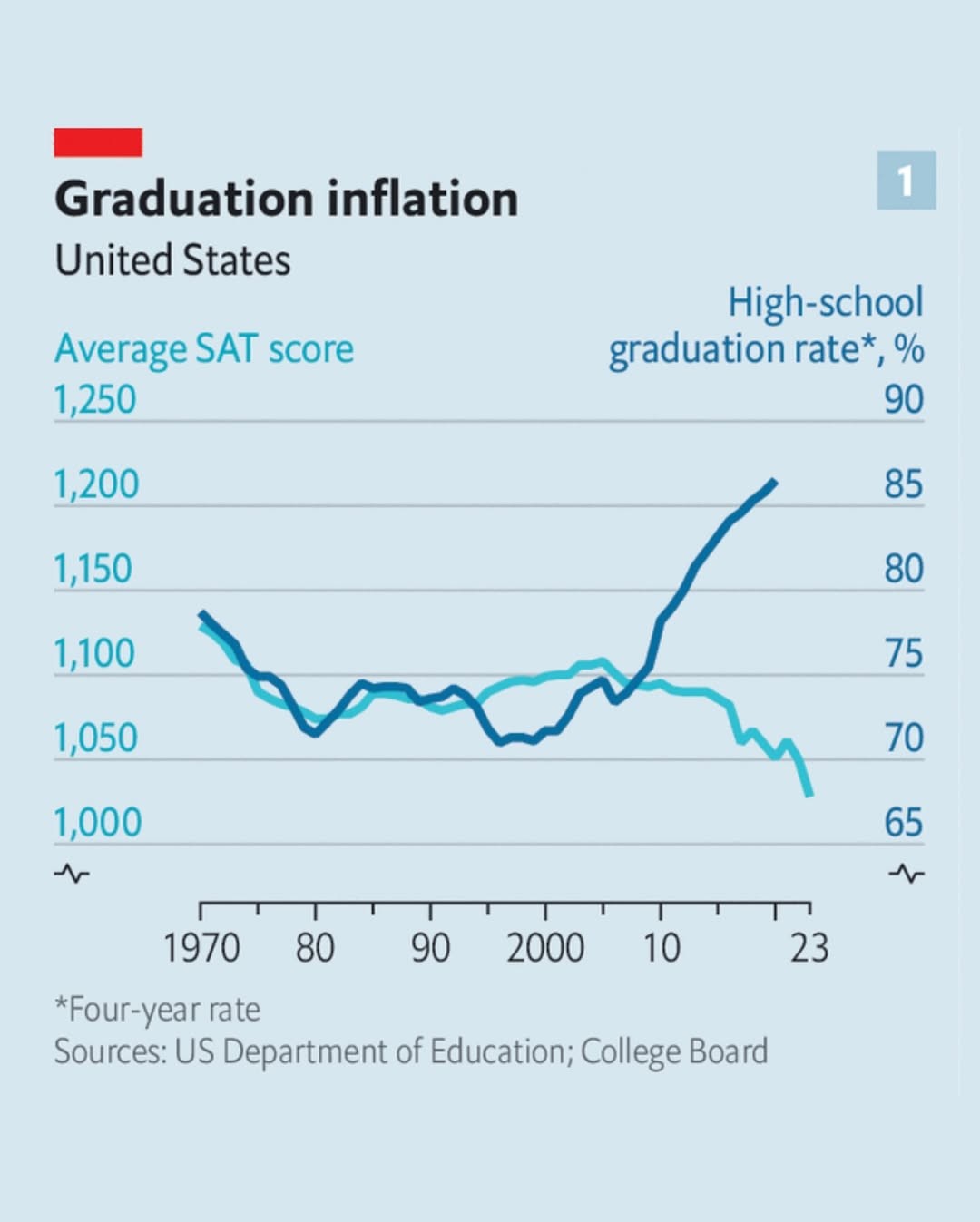
I generally agree that the graph doesn’t imply anything bad, but without knowing the distribution of test scores, we can’t conclude that average sat performance actually improved. With a general sat score statistic we could attempt to predict how an X% increase in presumed low performers looks like, and then compare that to reality.
The graph indicates the average test score dropped. I’m looking at what can be inferred from this limited data and how it could be structured to reveal a person’s ability to apply critical thinking.
The graph alone isn’t enough, it would need some blurb with the details you’re mentioning and more to make the choices unambiguous.