
Arkansas is 48th. Yeah, that tracks.
Mississippi and Alabama are even worse. Which also tracks.
Mississippi and Louisiana*
Alabama is 45
Yep, gotta make room for all those personal liberties
We are going to build a new prison though, and that will fix it you’ll see…
A very expensive prison in the middle of bum fuck Egypt. It will bring lots of kickbacks to the Sarah Sander’s cronies …err… I mean jobs
Utah ranks higher than Colorado. That’s a bit surprising. I guess crazy politics doesn’t weigh down the rankings.
Hi. I was born in Utah.
The statistics presented here likely primarily include Mormons. Mormons, granted, tend to experience higher rates of senses of well-being due to thorough, lifelong conditioning into a religion that (to put it very very lightly) trains and encourages wishful thinking and group conformity to levels that would make a tankie blush.
Those who leave this religion (cult that has the all-time gold medal championship title in doublethink and mental gymnastics in archeology) tend to experience significantly higher rates of suicide, mortality, and depression. The youth suicide rate alone shot up 192% from 2009 to 2014. https://www.rationalfaiths.com/wp-content/uploads/2016/03/LGBTQStats-2.pdf
Speaking from personal experience, Utah is a theocracy, straight up. The church controls everything from the state congress to the real estate. They have loopholes in the department of education that allow ecclesiastical education at public schools. I’d know, I graduated from one.
Fuck Utah.
If they have loopholes in the DoE for this, I’m sure the Satanic Temple can do so as well
I assume that’s because they drink almost no alcohol. That’s probably good for their health.
https://worldpopulationreview.com/state-rankings/alcohol-consumption-by-state
Utah is also a massive outlier when it comes to other Republican states.
Utah has a high percentage of its population with college education. It also has a relatively robust state welfare program compared to other Republican states. And, from what I’ve seen regarding comparative state politics, Utah’s political leaders appear to be relatively uncorrupt and able to plan long term growth.
The politicians are controlled by the LDS church and you think they are not corrupt?
I said relative, not absolute.
Crazy in your (or my) estimation.
I may not agree with people, but understanding their paradigm can be insightful.
I’m not sure why you are being picked on, but I agree that understanding what works is key to building a healthy society.
Well compare the rest and you should see at least some correlation.
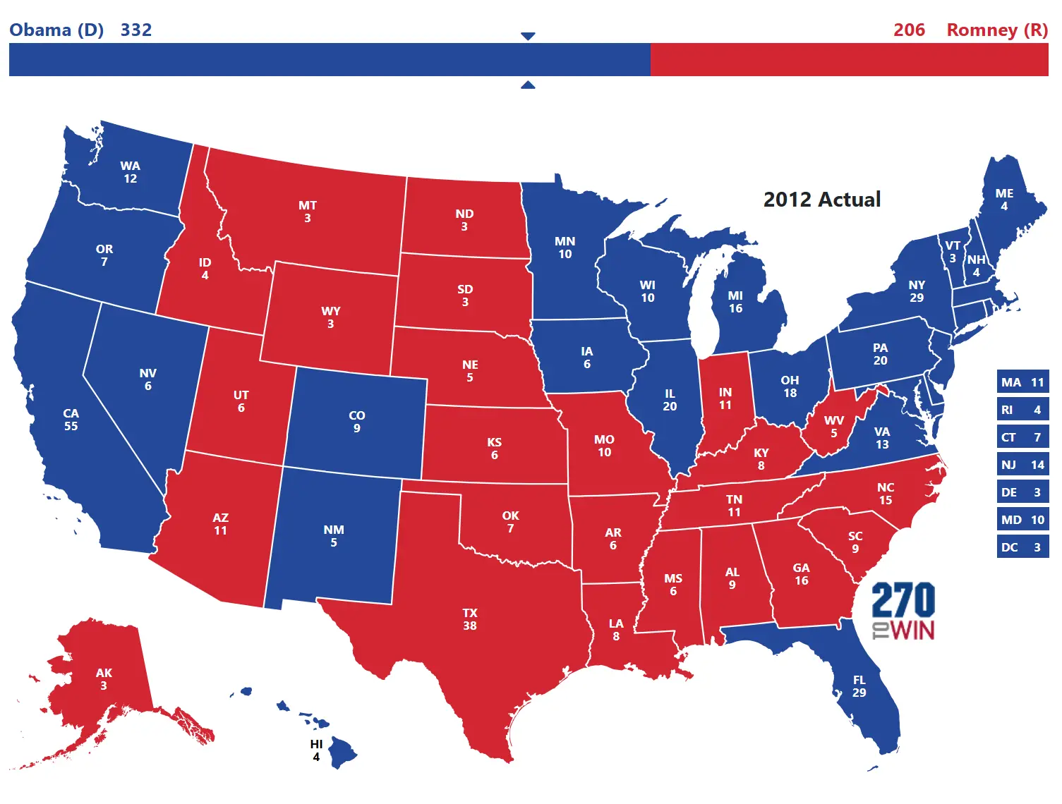
2012:
2016:

2020:

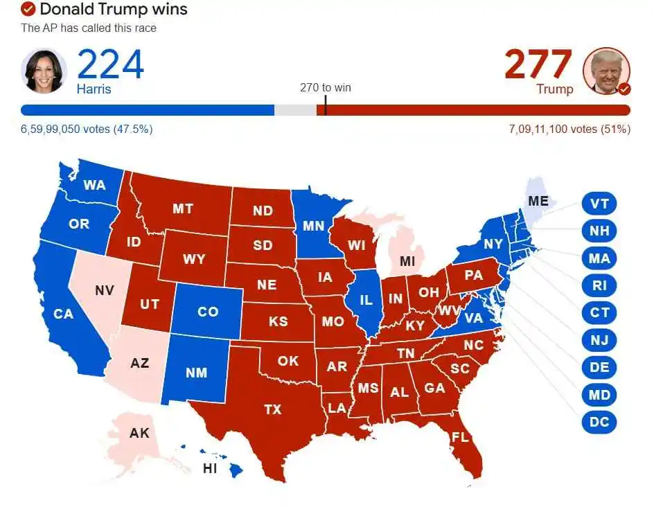
2024:
It’s so nice for Republicans that 100,000 acres of dirt matters more than a dense populace.
Huh… Who’d have thought New Hampshire would take the top spot? God knows I wouldn’t…(and I’m a native born resident)
Considering the amount of highly educated and higher paid residents work down in MA it kinda tracks.
Just shows the map creators biases, more than anything.
I’d not be happy in NH (no offense, beautiful to visit, skiied there a LOT, just not where I want to live).
The weights the map creator puts on things makes this a map of their values.
Maryland being 11? Yea, fuck that. Being trapped between 2 shit holes of DC and Baltimore, the insane traffic, etc (I know of what I speak, spent a LOT of time there). Lots of folks love that kind of business/chaos, I do not.
ND at 14? I don’t think the map creator has ever been to the Dakotas - it takes a special person to live where winters are that rough. ND has the lowest temps of the lower 48. Long stretches of zero and below. Only Alaska gets colder.
Jersey at 13…hahahahahahahahahaha
It’s not a map of favorite vacation spots. It’s overall wellness.
Sure, you might not be a fan of cold winters, but laying on the beach is no fun when you have no money and you’re slowing dying of a disease you can’t get treatment for.
Every story I’ve heard about the Dakotas has been dark AF.
The answer is Massachusetts, the hillbillies from New Hampshire just cross the border for medical care and some of their kids go to schools in Boston.
True. Only reason they have NH as #1 is the number of educated and well paid people that work in MA and relocated for the tax breaks.
Uh.
Uhoh. If Minnesota is number 4… Then this truly a map of the race to the bottom.
I moved from #40 to #5 over the summer. The difference is staggering. You can just tell how much happier everyone here is and it really makes a positive impact on the community as a whole.
Overall not that surprising. Some interesting differences between states, but regionally it’s what I expected.
It’s no secret, we ALL knew the conservative South is suffering.
I knew things were bad but holy hell.
Yall zone? More like no zone
Thing is this is by the metrics of the map creator.
Go to Appalachia and get to know those people - their metrics will be different than the map’s creator.
Paradigm has a lot of influence, and being open to understanding someone else’s will tell us a lot more than cobbled together maps like this.
Having lived and worked all over, I would be very, very unhappy to live in or near Chicago (or NY or Philly). That’s part of my metrics.
It’s not about cities, tho, it’s about the whole state (trust, there’s way more to Illinois than Chicago). Also, this isn’t just about the metrics of the map creator, it’s about studies of wellbeing in these states. It says at the bottom of the map what metrics it’s measured on.


