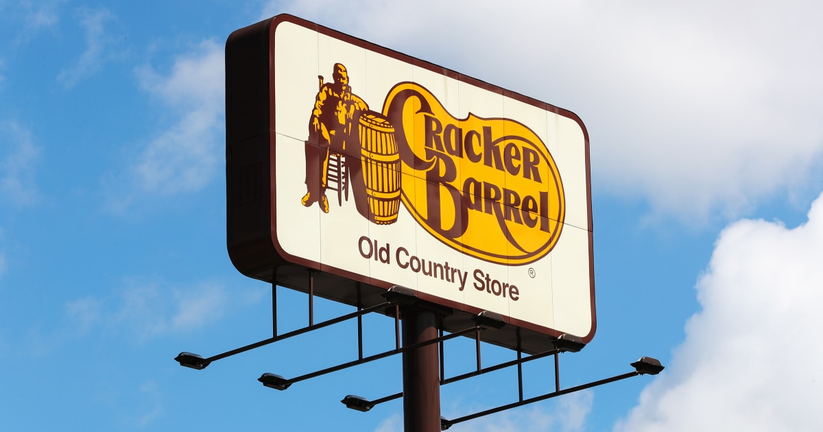
I don’t think that the old logo is great either, and the update did improve on technical aspects. You don’t want to have all that small text, for example. And generally, simpler logos are preferable.
But…their shtick is a rustic feel. Whatever you can say about the original logo, it did evoke that. I have a hard time seeing the new one doing that.
EDIT: I also think that this compares favorably to another controversial recent rebrand: Musk rebranding Twitter, which was generally seen as not a good idea; Twitter already had a strong brand identity. People weren’t happy and Musk went right ahead with it regardless. At Cracker Barrel, the initial response was “calm down, it’ll be okay”, but they were willing to second-guess themselves, even though I expect that there were people there who were invested in the rebrand.
EDIT2: They’d also done smaller, more incremental changes to the logo in the past, because the “Old Country Store” text had had its typeface changed at some point in the past.
According to another site, the logo was 1977, not 1997. Which tracks with another article mentioning a marketing person coming up with the design in the 70s
On the long drive to and from vacation last week I noticed the 2024-25 picture used a lot and I thought wait they already have a version without the other stuff and it looks fine so why the hell are they changing it again when its perfectly fine the way it is? My biggest complaint of the newest one was just that it featured no border. It already looked weird, but without that border, it just didn’t work at all.


I don’t think that the old logo is great either, and the update did improve on technical aspects. You don’t want to have all that small text, for example. And generally, simpler logos are preferable.
But…their shtick is a rustic feel. Whatever you can say about the original logo, it did evoke that. I have a hard time seeing the new one doing that.
EDIT: I also think that this compares favorably to another controversial recent rebrand: Musk rebranding Twitter, which was generally seen as not a good idea; Twitter already had a strong brand identity. People weren’t happy and Musk went right ahead with it regardless. At Cracker Barrel, the initial response was “calm down, it’ll be okay”, but they were willing to second-guess themselves, even though I expect that there were people there who were invested in the rebrand.
EDIT2: They’d also done smaller, more incremental changes to the logo in the past, because the “Old Country Store” text had had its typeface changed at some point in the past.
EDIT3: Here’s a more-comprehensive history:
https://dwglogo.com/cracker-barrel-logo/
I do find it amusing that the “classic” logo everyone is pining for is from the “ancient” year of 1997…
Tbf as weird as it sounds, ‘97 is vintage now
I hate you for pointing that out.
Counts on hands… Oh yeah, it’s over 10 years now isn’t it?
Officially 28 years ago
I think there’s a mistake, other sources say 1977 instead of 1997…
According to another site, the logo was 1977, not 1997. Which tracks with another article mentioning a marketing person coming up with the design in the 70s
If they’d just textured the background shape to actually look like a barrel it would be pretty good actually.
On the long drive to and from vacation last week I noticed the 2024-25 picture used a lot and I thought wait they already have a version without the other stuff and it looks fine so why the hell are they changing it again when its perfectly fine the way it is? My biggest complaint of the newest one was just that it featured no border. It already looked weird, but without that border, it just didn’t work at all.