- cross-posted to:
- [email protected]
- cross-posted to:
- [email protected]
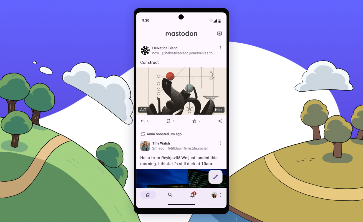
I hate Material U design. It is really like the Superflat design for 2020s with rounded corners and it looks really tedious.
Word.
Btw is there another Android app for Lemmy other than Jerboa? It feels like one of the biggest victim of the Material You template’s drawbacks.
Mastodon is just so empty as a platform. I hope for its success but I am not seeing it at this point the way we are with Lemmy.
This is a strange take - Mastodon makes up ~80% of the Fediverse, whereas Lemmy makes up like 3% or something.
Mastodon is the entire reason the Fediverse as a whole ended up taking off - for most people, it is the only thing they are aware of.
I think the reality is just that microblogging is always going to be devoid of content when compared to a messageboard system like lemmy or reddit
I’ve reinstalled it to take a shniff and I’m impressed so far, very clean and functional.
You don’t need to use the official Mastodon apps, they’re not the best way to use Mastodon. The official apps only arrived last year, and they were intended as “Fisher Price My First Mastodon” things with a restricted set of features.
Third party apps have been around longer than official ones, and include way more features. You can sign in with the same account on all apps.
:android: On Android try Tusky, Fedilab, Megalodon, Tooot
:apple_inc: On iPhone/iPad, try Toot!, Ice Cubes, Ivory, Mona
As per Feditips: https://mstdn.social/@feditips/110644814293019308


