Lemmy
  • Communities
  • Create Post
  • Create Community
  • heart
    Support Lemmy
  • search
    Search
  • Login
  • Sign Up
ElCanut@jlai.lu to Data Is Beautiful@lemmy.ml · 1 year ago

Beautiful but worrying 🌍

jlai.lu

message-square
22
fedilink
  • cross-posted to:
  • [email protected]
5

Beautiful but worrying 🌍

jlai.lu

ElCanut@jlai.lu to Data Is Beautiful@lemmy.ml · 1 year ago
message-square
22
fedilink
  • cross-posted to:
  • [email protected]
alert-triangle
You must log in or register to comment.
  • barrbaric [he/him]@hexbear.net
    link
    fedilink
    English
    arrow-up
    1
    ·
    1 year ago

    kitty-cri-screm

    • KurtVonnegut [comrade/them]@hexbear.net
      link
      fedilink
      English
      arrow-up
      1
      ·
      1 year ago

      screm-a aaaa

  • humbletightband@lemmy.dbzer0.com
    link
    fedilink
    arrow-up
    0
    ·
    edit-2
    1 year ago

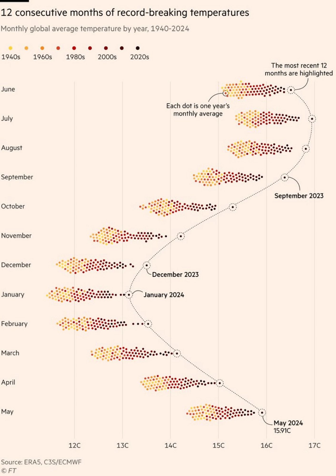
    Took me more than a minute to realize that only 4 months of this year hold the record. Well, let’s wait for 2030

    Edit: nope. Last 12 months indeed beat the records consequently . We’ll all soon die. The only good thing I can see from this graph is that the shift is even, meaning the seasons are still predictable.

    • NoMoreLurkingToo@startrek.website
      link
      fedilink
      arrow-up
      1
      ·
      1 year ago

      We will probably be underwater in 2030.

      I think that I should become a captain in a supertanker…

    • CommunistBear [he/him]@hexbear.net
      link
      fedilink
      English
      arrow-up
      1
      ·
      1 year ago

      The most recent months are the records, are they not? Yeah December 2024 doesn’t hold the record yet but it hasn’t happened yet. The most recent 12 months were the hottest

      • humbletightband@lemmy.dbzer0.com
        link
        fedilink
        arrow-up
        0
        ·
        1 year ago

        Looks like you’re right

        Visualization looks misleading then

        • driving_crooner@lemmy.eco.br
          link
          fedilink
          arrow-up
          1
          ·
          edit-2
          1 year ago

          Top right corner: “the most recent 12 months are highlighted”

  • Wes4Humanity@lemm.ee
    link
    fedilink
    arrow-up
    0
    ·
    1 year ago

    Why does it seem like this is only the northern hemisphere and not truly “global”? Shouldn’t it be warm in the southern hemisphere when it’s cold in the north? So shouldn’t these groupings generally hover around an average between northern and southern hemisphere temps?

    • Dark Arc@social.packetloss.gg
      link
      fedilink
      English
      arrow-up
      0
      arrow-down
      1
      ·
      edit-2
      1 year ago

      What’s your source that there’s not warming in the southern hemisphere?

      The temperature readings would look different because winter and summer are flipped, but they absolutely should be attributing a similar effect.

      • Wes4Humanity@lemm.ee
        link
        fedilink
        arrow-up
        0
        ·
        1 year ago

        That’s what I thought… But if it’s winter in the north then it’s summer in the south, so you’d expect them to average in a way that you wouldn’t see such stark differences between say January and July. In July it’s winter in the south, summer in the north. Intuitively I’d assume they’d average. Temps would still be rising year over year, but you wouldn’t see a difference between months. A couple people have answered that it has to do with the earths tilt and the fact that there’s more landmass in the north. Seems plausible I guess.

        • Dark Arc@social.packetloss.gg
          link
          fedilink
          English
          arrow-up
          0
          arrow-down
          1
          ·
          1 year ago

          Huh… So it does. Interesting.

  • Eheran@lemmy.world
    link
    fedilink
    arrow-up
    0
    ·
    1 year ago

    The color grading of the years is really bad. The last 20/30 years are all very low in contrast compared to each other, while 1940s and 60s are easy to tell apart, where it is least important. There are so many more colors than yellow/orange/brown, we can use them to get more information density.

    • wischi@programming.dev
      link
      fedilink
      arrow-up
      0
      ·
      1 year ago

      Quite the contrary. I have a red-green deficiency (and so do about 6% of men). Viridis Color scale is pretty nice but two much colors are hard to read for a lot of people

      • Dark Arc@social.packetloss.gg
        link
        fedilink
        English
        arrow-up
        0
        arrow-down
        1
        ·
        1 year ago

        We need to invent an image format that let’s chart colorw be tweaked after the fact lol

        • grue@lemmy.world
          link
          fedilink
          English
          arrow-up
          0
          ·
          edit-2
          1 year ago

          Actually, that’s a feature that was common going all the way back to the very earliest image file formats: https://en.wikipedia.org/wiki/Indexed_color

          It’d be easy enough to make the chart a plain old GIF or indexed PNG; the only non-trivial part is that you’d need add some code to the page it’s embedded in to swap out the color palette. (You could also make it an SVG and manipulate it even more easily using the DOM.)

          • Dark Arc@social.packetloss.gg
            link
            fedilink
            English
            arrow-up
            0
            arrow-down
            1
            ·
            1 year ago

            Well, the image format is based on indexed color for compression purposes … But it’s not like it calls out “these indexes should be customizable”.

  • Hello_Kitty_enjoyer [none/use name]@hexbear.net
    link
    fedilink
    English
    arrow-up
    0
    ·
    1 year ago

    nuke europe

    • ElCanut@jlai.luOP
      link
      fedilink
      arrow-up
      0
      ·
      1 year ago

      Why Europe ?

      • Hello_Kitty_enjoyer [none/use name]@hexbear.net
        link
        fedilink
        English
        arrow-up
        0
        ·
        1 year ago

        cause we need more land and they did global warming anyway

        (includes european settler states)

        • frightful_hobgoblin@lemmy.ml
          link
          fedilink
          arrow-up
          0
          ·
          1 year ago

          Who?

          • Hello_Kitty_enjoyer [none/use name]@hexbear.net
            link
            fedilink
            English
            arrow-up
            1
            ·
            1 year ago

            europe (including european settler states)

          • anaesidemus [he/him]@hexbear.net
            link
            fedilink
            English
            arrow-up
            1
            ·
            edit-2
            1 year ago

            off the top of my head, USA, Canada, Israel and Australia but probably not New Zealand and South Africa.

            Russia merits further discussion

            Japan, South Korea and Saudi Arabia could also belong on the list

Data Is Beautiful@lemmy.ml

dataisbeautiful@lemmy.ml

Subscribe from Remote Instance

You are not logged in. However you can subscribe from another Fediverse account, for example Lemmy or Mastodon. To do this, paste the following into the search field of your instance: [email protected]
lock
Community locked: only moderators can create posts. You can still comment on posts.

A place to share and discuss data visualizations. #dataviz

Visibility: Public
globe

This community can be federated to other instances and be posted/commented in by their users.

  • 1 user / day
  • 1 user / week
  • 3 users / month
  • 1.15K users / 6 months
  • 1 local subscriber
  • 8.21K subscribers
  • 156 Posts
  • 3.41K Comments
  • Modlog
  • mods:
  • sátur@lemmy.ml
  • Otter@lemmy.ca
  • Cirrokumulus@slrpnk.net
  • BE: 0.19.9
  • Modlog
  • Instances
  • Docs
  • Code
  • join-lemmy.org