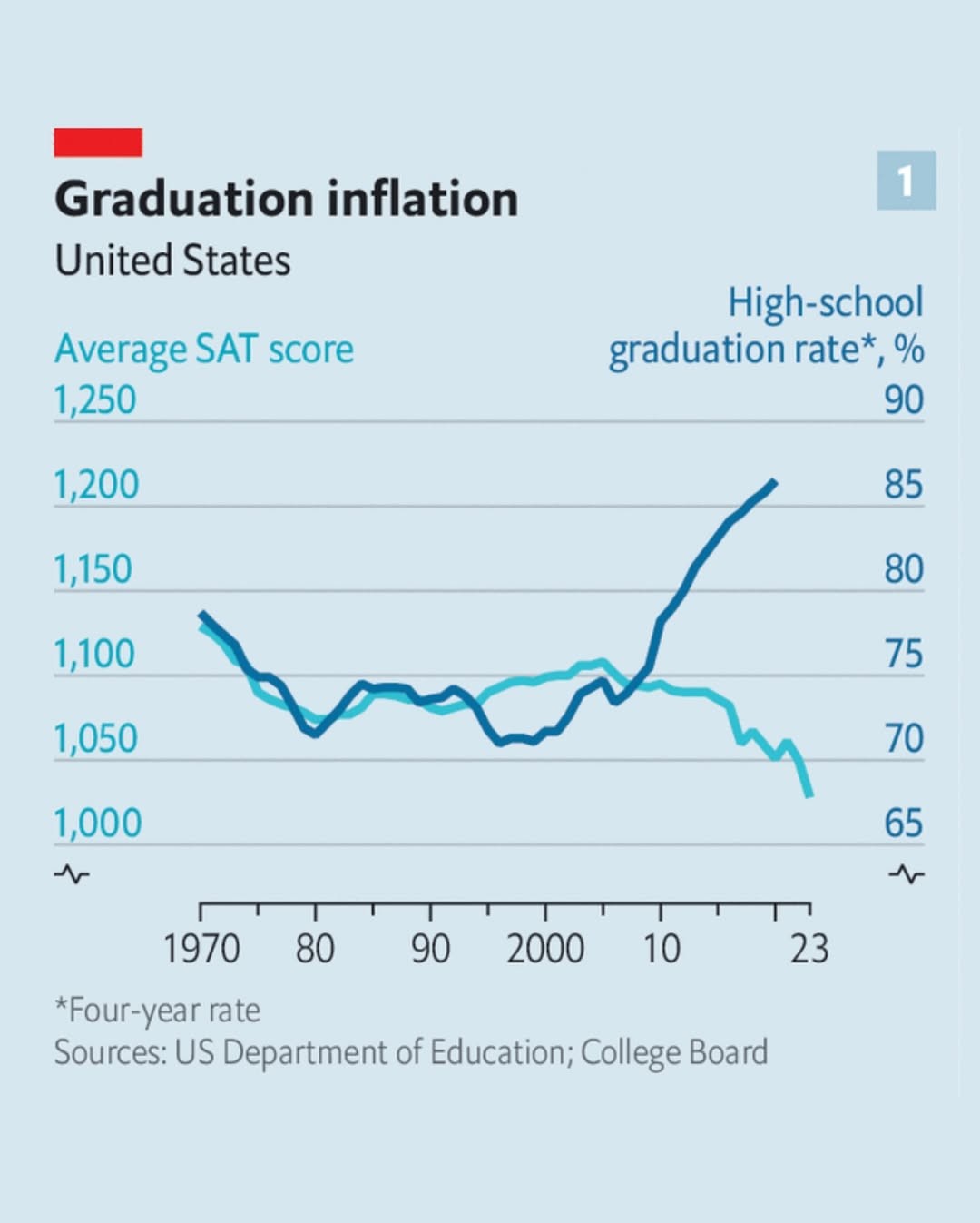
How does this chart factor in the decade 2005-2015, when the SAT was scored out of 2400? With prior to 2004 and since 2016 being scored out of 1600.
I knew about the first change, so it’s interesting that scores DROPPED while graduations shot up in '05 according to this chart. But I didn’t know about the 2016 change and I guess that is the next drop, but not by 800 points which is interesting.
I imagine they’re taking the score as a percentage then applying the percentage to 1600 instead of 2400.
But you’re right that it doesn’t seem to account for changes, either in the test or in the high school curriculum.