
I’m trying to figure out from this picture if it’s satire or not
Tim Apple needs to go and someone with taste should take over.
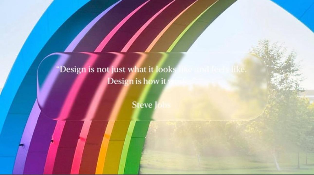
This image exemplifies everything that’s wrong with the transparency in the current iOS/macOS versions
My wife accidentally upgraded her phone and is hating it
Turn on increase contrast and or reduce transparency in accessibility settings.
Yeah, I’m an avid mac/i/iPadOS user, and that was a bad choice. And it’s sad, because it feels like a choice made just to have something to reveal at WWDC. I’d respect them a whole lot more with optimizations, performance improvements, and developer enhancements. I was good with 18, not to mention some elements from the older designs.
Design is the intent behind the product. Good design is when the user is empowered without being able to identify any specific design choices.


