

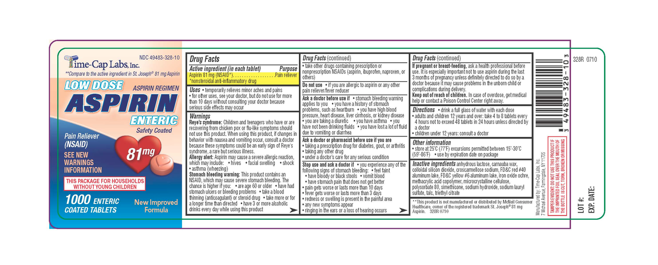
(Generic label used for illustrative purposes)
Instead of having the directions clearly, consistently, and conveniently at the top, it’s expects you to unfurl the damn label like a scroll, read through the tiny print until you get to the directions and dosing information.
I’ve already got a headache. I don’t need to be squinting at this tiny text to try to find the one bit of relevant info I need. I just want my headache to go away for a while.
It’s not just aspirin, ibuprofen, etc. It seems like everything with a label is like this now.
This is not a sea of text. The structure is clearly outlined (literally), with each section stating in bold what it’s about. If you cannot comprehend this, the problem is your reading, or more precisely, your skimming skills.