
edit: url got cut, http://www.effectgames.com/demos/worlds/
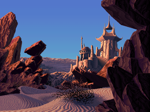
This link is an HTML 5 demo of palette shifting, a method that was widely used in the 90s in computer graphics when you were limited to 256 colors for a scene, i.e. whatever was rendered on a screen. The images shown in the demo all come from an artist who drew and put them together in the 90s, and a developer made a demo that lets you not only pick the scene but also shift the palette on it.
The tech behind it is simple enough: you only have 256 colors max, and each color is mapped to an ID. So color #1 can be #ffffff (pure white) or #000000, or any other color you want. The trick is, two or more color IDs can have the same color on it. Switching the palette could be done on the fly back in the day, so by just loading another palette, you can entirely change the color of a scene. It’s also how they get the animation, they change just a few IDs on the palette very rapidly (but BlendShift is something the artist designed more recently and works by interpolating colors if I understand correctly, giving the animation a smoother look).
Which scene and time of day is your favorite? I have a hard time picking the one I want for my wallpaper lol. I’m gonna try and ‘rebuild’ them and see if I can get a similar time-of-day effect for my wallpaper.
There’s more scenes on this other demo, but no clock to pick the time: http://www.effectgames.com/demos/canvascycle/
Absolutely beautiful artworks and you can imagine the amount of work that went into this not only to paint the scene, but also to code it into a computer afterwards.
Okay, I was able to extract some of them to use as a dynamic wallpaper.
Gnome (Linux) allows you to set an .xml wallpaper composed of as many images as you want, and a timer until it transitions to the next one.
On the demo website, you can simply right click -> Save as to save the image you see on the screen. So I just grabbed a scene I liked (haunted ruins though to me it’s more like a lost temple), and saved some stills that I liked, e.g. the one at midnight, 6AM, etc. All in all I have 10 different ones.
To make the images fit your screen, since they are pixel art you want to upscale them without interpolation - that’s the trick to this. Gimp or Photoshop can do it. I blew them up to the width of my monitor and then cropped them to a 16:9 aspect ratio, and they look just as crisp as the low-res 4:3 version.
Then I simply went on deepseek to generate the xml – it knew how to structure it from earlier in the conversation. I gave it the path to the images and when I wanted them to show (so 06-00.png shows at 6AM etc).
It generated two xmls, one is the one that says “load this image at this time”, and another that says “we want to load this xml with these parameters”. Go to your wallpaper picker on gnome and select the second xml. I had to move back and forth between the folders for the file to show up, but it works great! Just had a transition happen while I was writing this comment.
If you ever want to add more images you can add them to ~/.local/share/wallpapers (seems pretty important to have them in there, wouldn’t work without it), give them a unique name, and then ask deepseek to regenerate the xml.
It looks pretty dope ngl, and I’m probably going to be slowly be adding more images to it to have smoother transitions lol.
Video game art from the 90s looks so much better than any “AI” generated so-called “art” today.
I mean these artworks are from Mark Ferrari, who is a pioneer in 2d computer graphics and worked on games such as Secret of Monkey Island. He invented dithering to get more than the 16 colors computers allowed at the time; he’s basically THE feel of 90s games x)
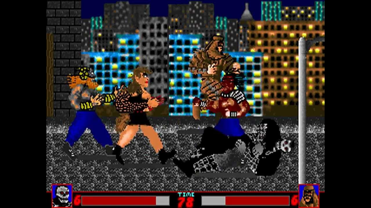
Compare to a game from 1992, Executioners, for DOS (so 2 years after Monkey Island):
Thanks for posting, now I want to play a new Point & Click featuring art like this.
I’d rather see indie devs trying to move towards this than that ugly low poly shit, or that generic hyper-realistic look.The art was made by Mark Ferrari back in the 90s when he was at the height of his career, so if you look for games he was involved in (Lucas Arts mainly iirc) you should be able to find a few from back in the day.
I love the use of screen tones on the waterfall one
The jungle waterfall? That one is a classic haha, it’s on almost every wallpaper website.
I like how the sun is moving from the background to the foreground on that one
I like the “mirror pond clear” one right around ~5:30pm. The lighting reminds me of when I would go hang out in an empty lot near my house as a kid after school
Lol looks like the background of a fallout 1-2 scene
