EfreetSK@lemmy.world to Map Enthusiasts@sopuli.xyz · 2 months agoYear and method of last execution by country in Europejakubmarian.comimagemessage-square59fedilinkarrow-up1231arrow-down18file-text
arrow-up1223arrow-down1imageYear and method of last execution by country in Europejakubmarian.comEfreetSK@lemmy.world to Map Enthusiasts@sopuli.xyz · 2 months agomessage-square59fedilinkfile-text
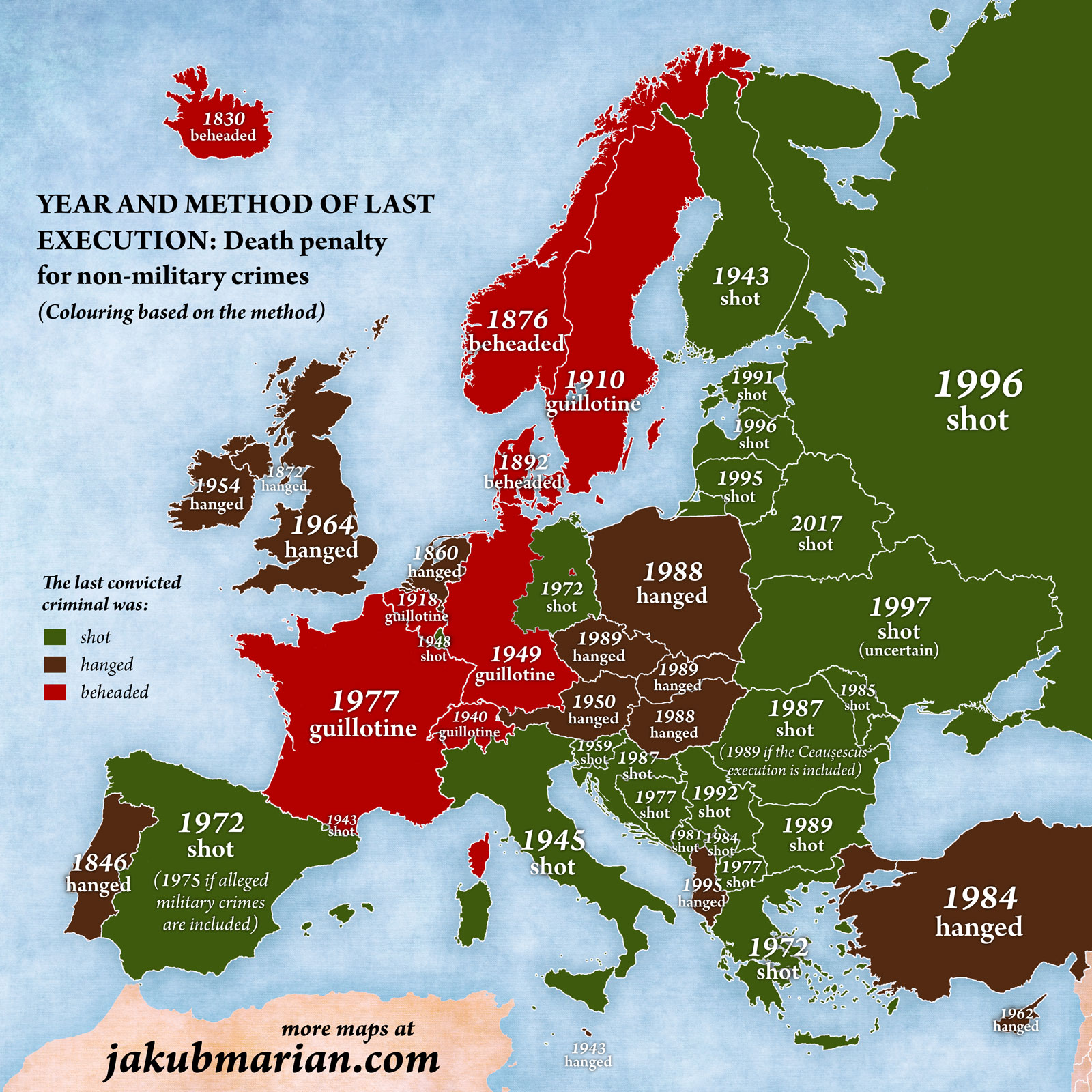
minus-square𝕲𝖑𝖎𝖙𝖈𝖍🔻𝕯𝖃 (he/him)@lemmy.worldlinkfedilinkEnglisharrow-up33·2 months agokinda wish the color was by year instead of method.
minus-squareSkua@kbin.earthlinkfedilinkarrow-up9arrow-down2·2 months agoDue to the methods and years being roughly correlated the colour scheme makes it look like the map is saying that more recent is better


kinda wish the color was by year instead of method.
Due to the methods and years being roughly correlated the colour scheme makes it look like the map is saying that more recent is better