
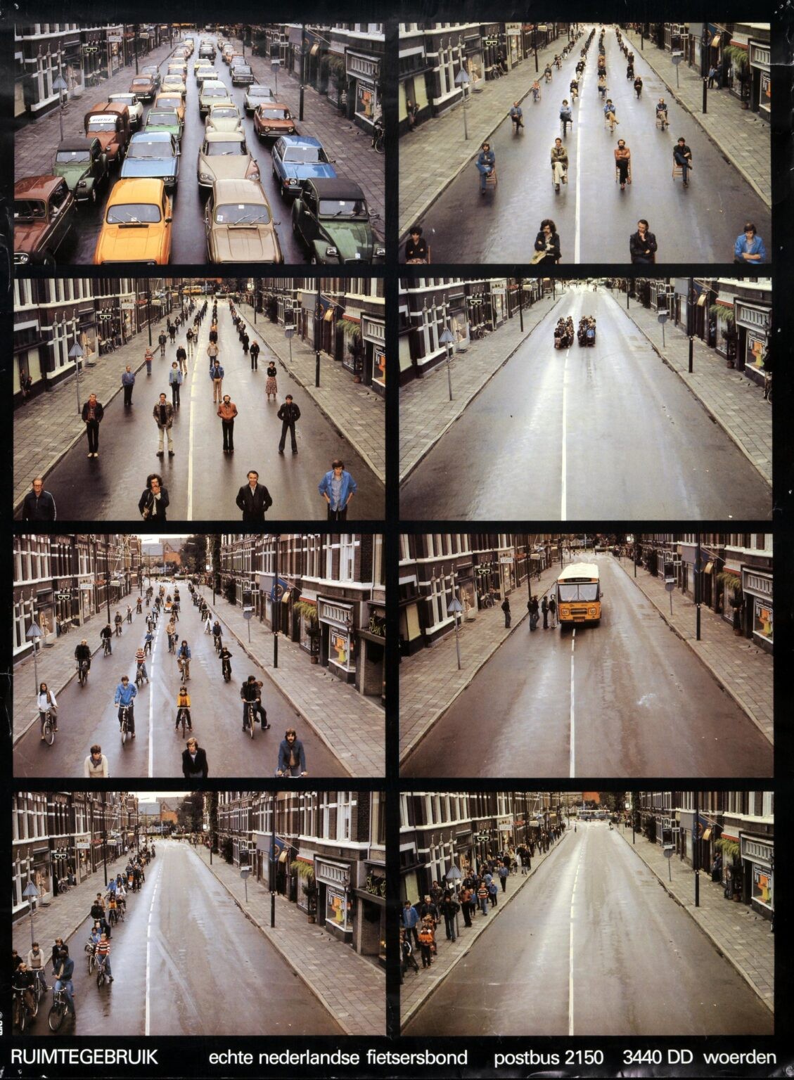
Got an email today from the dutch cycling association because they are celebrating their 50th cakeday in which they shared a post with some of their old posters. Most don’t make sense if you don’t speak dutch, but they’re here: https://www.fietsersbond.nl/50-jaar-fietsersbond-campagnes-en-posters/
Edit: turns out they’re quite proud they made this poster and wrote a whole post about it in english. Not instead of the other url, but an addition for sure: https://www.fietsersbond.nl/english-info/whose-space-is-it/.
Great idea, but I think the panels are out of order. This makes more sense to me:
They’re not out of order, it’s just there are two orders. The left side is “what if bicycles” themed and the right side is “what if bus” themed. Except the top left is shared, of course.
Obviously it could have been presented more clearly though.
Okay, maybe not out of order exactly, but they make more sense in my version.
For mine, it’s a progression of simpler and simpler transportation:
Top four show the space savings of a bus. Next two show the savings of bikes. Final two show savings of pedestrians.
I’ve seen versions of this that make more sense then this poster as well, reason for sharing it is mainly because it’s age shows that the concept of space for people (vs space for machines) has been relevant for a long time now.
Edit: Also notice how much this street look like some streets in some countries, but look nothing like inner-city streets in the Netherlands. Roads without bike lanes are extremely uncommon nowadays.
Yeah, it’s a cool share for sure
I thought the last one is about showing how small the side walks are.