
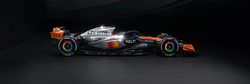
Is that supposed to be camo print in support of ICE
Oh god… both RedBull teams often seem to just slap whatever they find on top of their cars for special livery day… this is a new low
What even is this? Why does this pattern make my eyes hurt?
Edit- It’s supposed to be tortoise pattern.
The livery is a nod to sponsor Cash App and its tortoise prepaid Visa debit card
It’s so bad it makes the normal RB livery look good.
Looks more like a leopard pattern to me.
No one watching this GP will make the association “ah yes, this references the Visa card!”
Wow, this is ugly. Are those supposed to be leaves? Why are leaves American?
I think it looks like nachos. So that works.
Damn this looks mad disgusting in this photo. Maybe it looks better on the track
It looks more Vegas then Austin.
