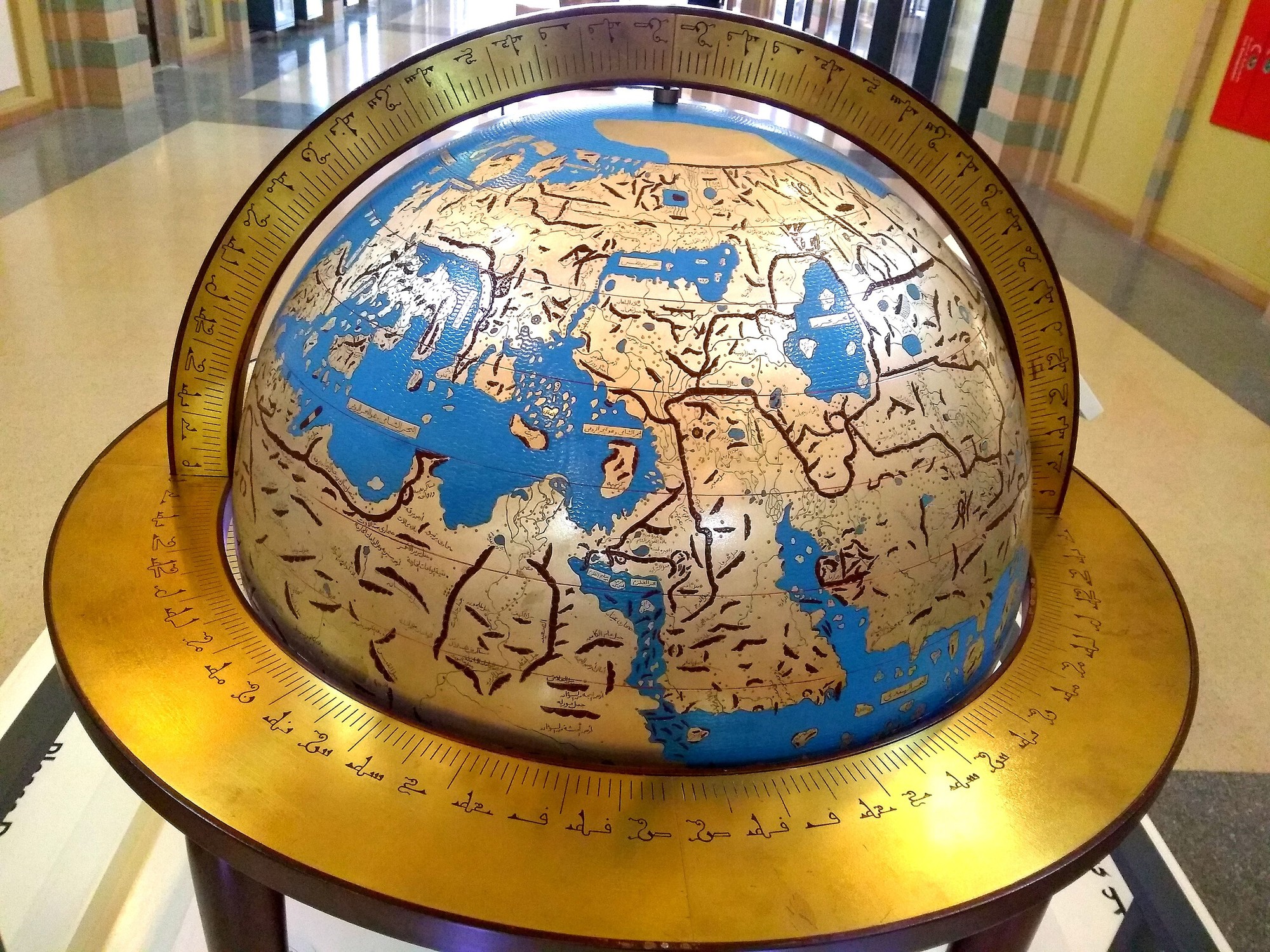
Ouch. Clearly they hadn’t mapped the locations of places to the stars for that map, or it’d have been obvious they’re missing a looot of data. Like, two or three more continents’ worth.
Several estimates of the Earth’s size even in the BC era weren’t so far off reality.
Edit: After peeking at a real globe, it might just ‘look’ more off than it is because of how perspective works. It still doesn’t quite look right, but it may not be underestimating the size by tooo much. Though it’s definitely underestimating it by measurable quantities.
The main interest here is probably in estimating distances between known lands. An entire half-globe of ocean is probably a bit of a waste of materials.
But that completely defeats the point in representing it on an actual globe, though. Things get distorted when they’re not to scale. They should’ve known that, which begs the question as to why they did it.
By your logic, they’re making the entire thing far less useful and basically inaccurate so they can … show more detail?
I call BS. It’s far more likely, IMO, that they’d only go through the effort of producing something so intricate to attempt to either show how neat their current understanding was, or to explore that understanding. Neither requires them to lie to themselves.