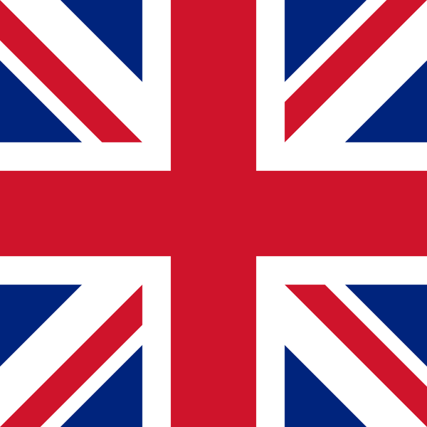
I have to laugh about the fact that half the flags are the wrong way around so here is a friendly guide.
It assumes the flag pole is on the left by the way.
I have to laugh about the fact that half the flags are the wrong way around so here is a friendly guide.
It assumes the flag pole is on the left by the way.
Why is it not symmetrical though?
(I’m going to call them Xs because referring to them as saint’s crosses or whatever can be confusing)
because if it were symmetrical, the white X would look like it’s merely a border to the red, which is not supposed to be the case because it’s a separate symbol.
there’s also optical alignment at play. i didn’t find much about this online but as a designer I’ve learned that diagonal lines, if broken by another object, can look weirdly crooked if perfectly aligned, so if you actually slightly misalign them you can make them look more straight. the red X here is broken, but it still looks centered rather than to the side of the white X.
They did this to themselves.
Because of the way it is! Duh!
To illustrate the equal partnership between England and Scotland. England gets the foreground, while Scotland gets the pride of place in top left corner.
It’s because the part representing Scotland is elevated in heraldry over Northern Ireland.