


The African Union has backed a campaign to end the use by governments and international organisations of the 16th-century Mercator map of the world in favour of one that more accurately displays Africa’s size.
Created by the cartographer Gerardus Mercator for navigation, the projection distorts continent sizes, enlarging areas near the poles like North America and Greenland while shrinking Africa and South America. “It might seem to be just a map, but in reality, it is not,” the African Union Commission deputy chair, Selma Malika Haddadi, told Reuters, saying the Mercator fostered a false impression that Africa was “marginal”, despite being the world’s second-largest continent by area, with more than 1 billion people. The union has 55 member states.
This projection feels like the uncanny valley to me. It’s obviously an overall pattern I’m familiar with, but it’s still slightly jarring.
Every single 2D projection of a 3D spheroid will be trash. All of them.
The only difference is what you’re going to distort.
…I should feel more invested on that, given I’m from SA, but I don’t care too much.
True, but there are projections designed to compromise multiple factors, whereas Mercator Al has a specialized use case, so it’s easy to agree that it’s a poor layman/general projection
If they’re really concerned with how big they look on a map, they should advocate for the Madagascator projection.
Check out the map men video https://www.youtube.com/watch?v=jtBV3GgQLg8
Well, modifications to Mercator world maps are not a bad idea, people genuinely don’t understand the size differentness (both ways - equatorial ppl how smol northern & southern territories are & the other way around, eg Europeans how big most of Africa is in comparison).
The bad part of normalising anther type of sphere projection for this purpose is that it almost certainly wouldn’t follow just one simple rule like Mercator’s. And with that exact predictability actually diminished in a way.
Eg, we could try to keep countries as close to the same-ish size & in return shrink (or have gaps in) oceans. Or keep smaller gaps between counties/some squares. Or have several different projections merged into one global map. Etc.
All of it is always arbitrary.
The true answer is only education (not necessarily, but preferability in early school days).

wiki/Waterman_butterfly_projection:
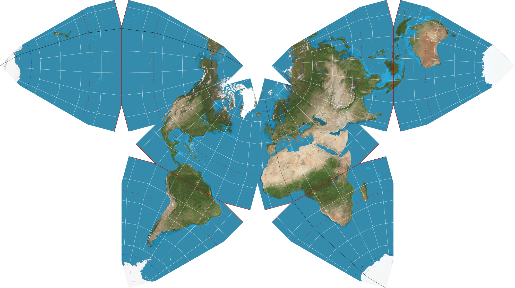
I vote for the Waterman Butterfly Projection
Mercator is a good projection for navigation for a variety of reasons. It should never have been used for geology classes in schools, but I think what originally happened is schools would just buy a nautical chart and put it on the wall.
Even when I was at school long before that episode of West Wing, my classroom had a Robinson Projection map, so the whole controversy seems like something that was ginned up possibly decades after Mercator was no longer in use except where it’s needed.
That being said Google used a broken version of mercator on their maps for many years…
