
- cross-posted to:
- [email protected]
- [email protected]

- cross-posted to:
- [email protected]
- [email protected]
You must log in or register to comment.
Howard is a treasure. Spot on as usual
TL;DR?
Crazy how >1000 words needs a summary.
how could one manage living an adult life like that?
MacOS’s UI is shit as always.
“Users don’t like MacOS’s liquid glass, especially not me, but they released it anyway and this is bad.”
If only there was an alternative.
Oh well
Ah thanks, so a slop article that barely belongs in the community here. Got it.
Come on dude, please use your own brain. The article is not AI slop - it is an informed rant about an UI topic from someone who knows what they are talking about. Please read the fucking article before accusing it of being AI slop - I mean, your whole post is kind slop. Just writing “TL;DR” and then spitting wild accusations and pronouncing that something does not belong into the community after reading a misleading one-sentence summary is sloppy as fuck. You can do better, dude!
Who’s talking about AI? And there is no article, not even a summary. It’s just a link dump.
What are you talking about? Just click on the link and read the article. Like, well, you should do with every link that gets submitted here in this community.
I will not read every article.
That’s ok - but why would you then want to discuss an article you don’t want to read on the internet?
Let’s just agree to disagree, I personally don’t like to be reliant on external sources when there is no good reason to not post the article directly.
I mean… it’s not slop. It’s a good, old-fashioned well-supported rant about how Apple has abandoned good user interface design.
<old man shakes fist at cloud> I do wish that anal-retentive, careful, thoughtful geeks would come back into power in place of flashy shallow thinkers.
But I can’t say I expect shaking fists at clouds is likely to accomplish much.
Looking back, I think it was a freak accident that the ARCTG crowd ended up calling the shots originally. Computer design was considered janitorial/secretarial style work by powerful people in the beginning, and it wasn’t until the late 90s that the “get rich quick by taking advantage of others” crowd realized there was a lot of money to be made.
Arctg? (Anal-retentive, careful, thoughtful geek).
I initially thought it was slop, and then I looked at who wrote it. This is someone I have a lot of respect for.
Personally, I’ve used every Mac UI from the original Twiggy interface, and prefer the UI of Mac OS 7.6.1 with Greg’s Browser, OtherMenu and DragThing. If I could get a macOS back-end with that user interface on the front end, I feel I could get stuff done faster with less frustration.
There was nothing wrong with the original Xerox PARC or Apple HIG documents; their findings still hold true today.
Bad ui
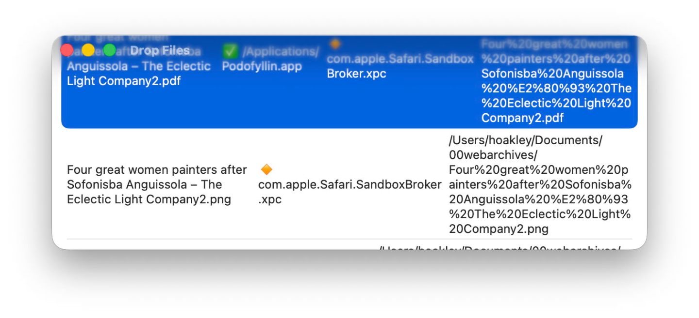
I’ve yet to actually see anything like that on Tahoe. This is most likely just an app that isn’t updated yet. It’s a bad example.
There is a summary at the bottom of the article.
Summary
macOS Tahoe’s visual interface:
- Fits largely rectangular contents into windows with excessively rounded corners.
- Enlarges controls without any functional benefit.
- Results in app icons being more uniform, thus less distinguishable and memorable.
- Fails to distinguish tools, controls and other interface elements using differences in tone, so making them harder to use.
- Makes a mess where transparent layers are superimposed, and won’t reduce transparency when that’s needed to render its interface more accessible.
Maybe this is because I’m getting older, but that gives me the benefit of having experienced Apple’s older interfaces, with their exceptional quality and functionality.
Ah thanks again, now this would have been handy to include inside the body of the post to begin with.
That’s true. And at the top of the article instead of the bottom.
That’s why I didn’t upgrade to Tahoe
I don’t really care one way or the other about Liquid Glass but if I could have Tiger on all my computers I’d be a happy camper


