You must log in or register to comment.
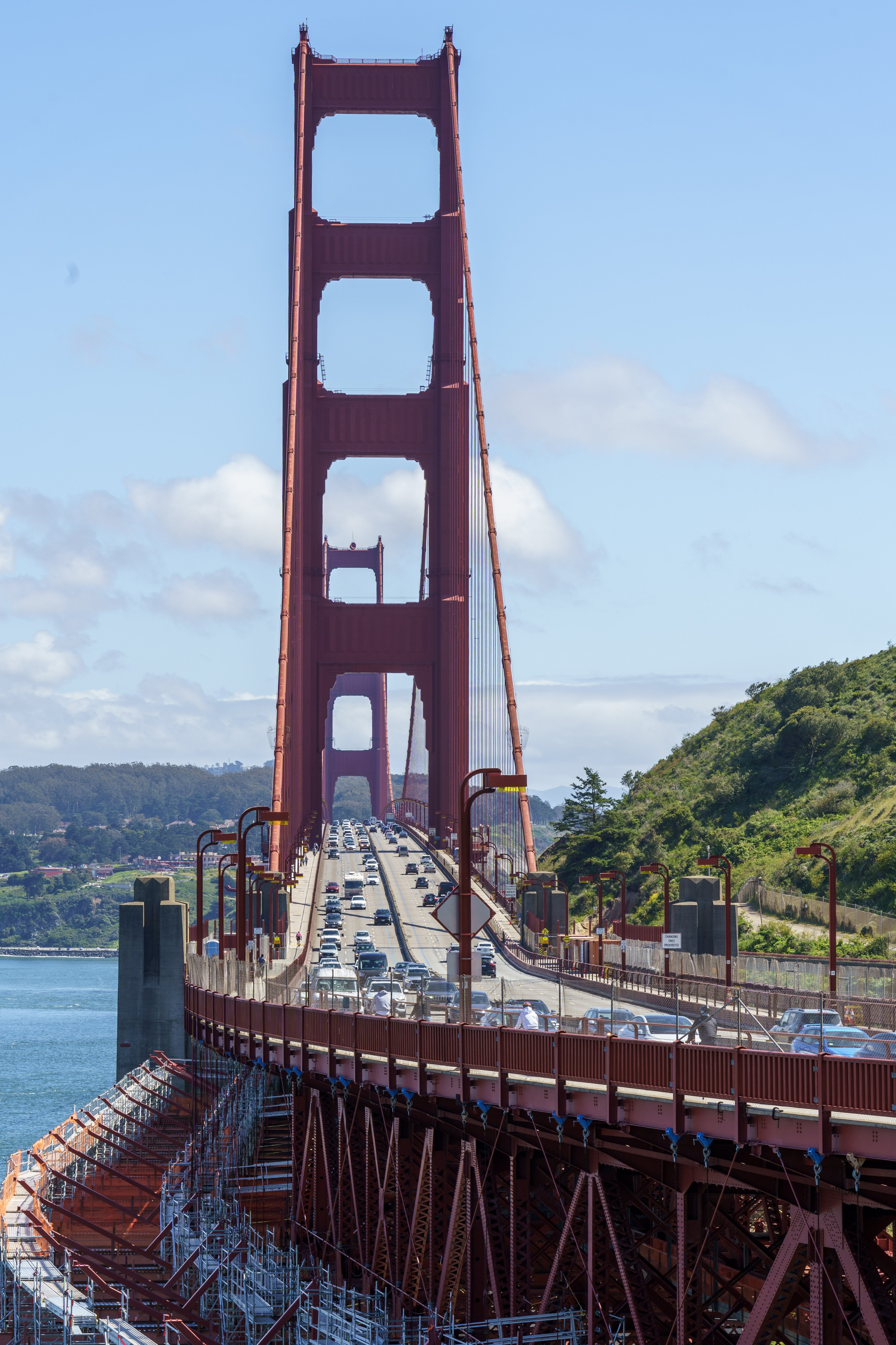
This is a really solid shot. Its hard not to love pictures of this bridge.
You didn’t ask for it, but here is some criticism:
- The framing is slightly off. The view second tower is slightly obstructed in an unpleasing way
- The color is a bit flat, I feel color is of the highest importance with this specific landmark
- The scaffolding at the bottom left feels like an afterthought. Maybe include more or less of it to tell a story about the bridges current state.
- The sky is kinda boring. Try adding more color to make the blue pop. Alternatively, wait till sunset to get that gold to pop.
Please take more pictures. You have an eye for it so keep pushing forward. Share more!
Thanks, I appreciate the feedback!
What is the purpose of all the scaffolding?
They’re putting in suicide nets to save jumpers… it should be finished some time this year.
…testing something I saw in another thread, don’t mind me …
@[email protected] tell me about the Golden Gate Bridge.
Edit. Huh. Well there you go.
Where gold?
The Golden Gate is the name of the strait the bridge spans, and has nothing to do with the color of the bridge, which is called International Orange.

